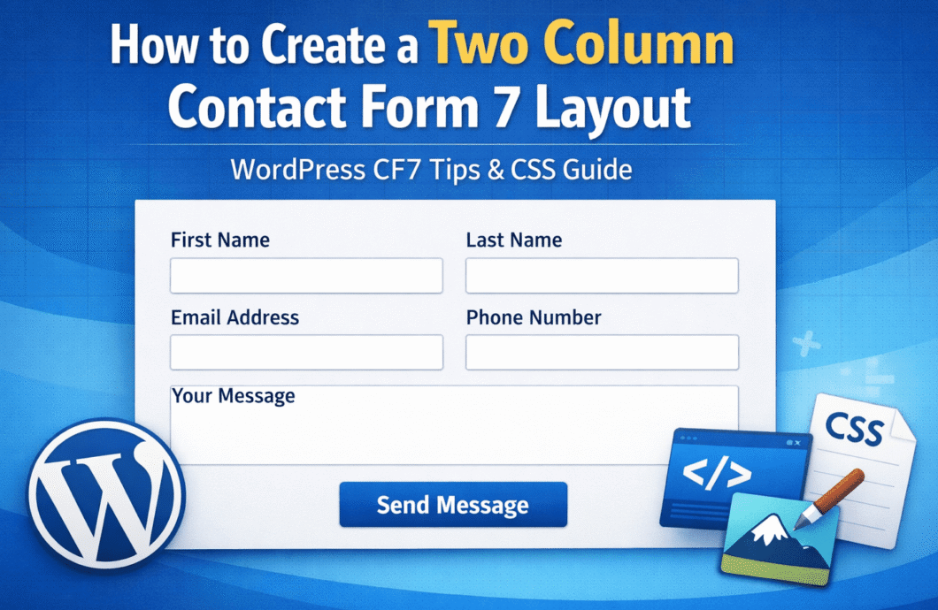
Using a Two Column Layout for Contact Form 7 Forms
Contact Form 7 does not support column layouts out of the box, which is a common frustration for WordPress users trying to build cleaner and more professional contact forms.
Two column layout offers several advantages:
- Better User Experience: Displaying more fields on the screen at once improves the user experience by making the form appear less overwhelming.
- Improved Design and Structure: A 2-column layout helps achieve a neat, modern design that looks professional and visually balanced.
- Space Efficiency: This layout allows you to use the space on your page more efficiently without making your form appear too long or cluttered.

Step 1: Setting Up Your Contact Form 7
Before applying any custom styling, create your form or modify an existing one in Contact Form 7:
- Go to Contact > Contact Forms in your WordPress dashboard.
- You can either click on an existing form to edit it or click Add New to create a new form.
- For this example, let’s create a simple form with the following fields:
<label for="name">Name</label>
[text* name id:name]

<label for="email">Email</label>
[email* email id:email]

<label for="message">Message</label>
[textarea* message id:message]
Once your form is ready, we will move on to styling it with CSS.
Step 2: Customizing the Form with a 2-Column Layout Using CSS
The next step is to make your form fields appear in a 2-column layout. This can be easily achieved by adding some custom CSS. Follow these steps:
- Navigate to Appearance > Customize in your WordPress admin panel.
- Go to the Additional CSS section and add the following CSS code:
/* 2-column layout for Contact Form 7 */
.wpcf7-form .form-row {
    display: flex;
    flex-wrap: wrap;
    gap: 20px; /* Adds space between columns */
}

/* Style for form labels and fields */
.wpcf7-form .form-row label,
.wpcf7-form .form-row input,
.wpcf7-form .form-row textarea {
    width: 48%; /* Each form element will take up 48% of the container's width */
}

/* Full-width style for the textarea */
.wpcf7-form .form-row textarea {
    width: 100%;
}

/* Optional: Add some spacing between form rows */
.wpcf7-form p {
    margin-bottom: 20px;
}
Step 3: Organizing Form Fields into Rows
For the CSS above to work, you’ll need to wrap each group of fields you want to appear in the same row with a <div> tag and the class form-row. Here’s how to structure your form:
<div class="form-row">
    <label for="name">Name</label>
    [text* name id:name]
</div>

<div class="form-row">
    <label for="email">Email</label>
    [email* email id:email]
</div>

<div class="form-row">
    <label for="message">Message</label>
    [textarea* message id:message]
</div>
This ensures that each form field within a .form-row is displayed in the same row. The fields will be split into two columns according to the CSS.
Step 4: Preview and Test Your Form Layout
Once you’ve added the CSS and adjusted your form structure, it’s time to check how the form looks on your site:
- Open the page where the form is embedded.
- Refresh the page to view the updated 2-column layout.
Your form fields should now be neatly organized in two columns, providing a more efficient use of space and improving the overall look of your form.
Make Sure It’s Responsive on Mobile Devices
Responsive design is important for ensuring that your form looks great on all devices, especially smartphones and tablets. Fortunately, you can easily make the 2-column layout adapt to smaller screens by adding a media query to your CSS:
@media (max-width: 768px) {
    .wpcf7-form .form-row label,
    .wpcf7-form .form-row input,
    .wpcf7-form .form-row textarea {
        width: 100%; /* Stacks form fields vertically on smaller screens */
    }
}
This CSS rule ensures that when the screen size is smaller than 768px (which covers most smartphones), the form fields will stack vertically and take up the full width of the screen, making the form more user-friendly on mobile devices.
Need Help Customizing Your Contact Form 7 Layout?
Hire a certified WordPress expert from Codeable to help you create custom Contact Form 7 layouts tailored to your site’s needs.